
Thanks man.........It was kina funGarr wrote:Not bad at all. Remember that you can add a 1px stroke to text to help make it stand out. I'm not saying you need that here. . .but it's a SIMPLE yet valuable tool.!
I'm diggin it!
HELP!! I dont know what I am doing!
Moderators: MrSpall, bassjones, sevesd93, zenmandan
-
HillgrassBluebillyFTW
- Hillgrass Bluebilly FTW

- Posts: 2517
- Joined: Fri Aug 18, 2006 2:50 pm
- Location: 46802
- Contact:
it's looking good...
in my personal opinion.. I would change the fonts of the myspace and monkeywings web addy's to match the rest of the fonts on your flyer.
It's just a personal thing I have.. call it OCD with Consistency. (sp?)
in my personal opinion.. I would change the fonts of the myspace and monkeywings web addy's to match the rest of the fonts on your flyer.
It's just a personal thing I have.. call it OCD with Consistency. (sp?)
1. I am the true vine, and my Father is the gardener. 2. He cuts off every branch in me that bears no fruit, while every branch that does bear fruit he prunes so that it will be even more fruitful. - Romans 15
If you want to know what I am working on check out these sites:
OhSoHumorous.com
TopDailyMemes.com
RandomDailyMemes.com
BestDailyMemes.com
FortWayneMusic.om
Kwalis.com
SoHumorous.com
FailUniversity.com
FaceFullOf.com
NuZuDu.com
FireFlyGoods.com
ThePeopleBlog.com
StealMyMemes.com
DontStealMyMemes.com
More to come...
-
Oliver's Army
- Too Much Free Time

- Posts: 3228
- Joined: Mon Mar 08, 2004 5:14 pm
Downloaded images from internet = FREE
Advice from graphics guys, Garr, Ando, Ollie and Sharky = FREE
Labor to redo flyer graphics = FREE
Kick ass first try Pheen Flyer = Priceless.
Advice from graphics guys, Garr, Ando, Ollie and Sharky = FREE
Labor to redo flyer graphics = FREE
Kick ass first try Pheen Flyer = Priceless.
If you want to know what I am working on check out these sites:
OhSoHumorous.com
TopDailyMemes.com
BestDailyMemes.com
FortWayneMusic.om
Kwalis.com
SoHumorous.com
FailUniversity.com
FaceFullOf.com
NuZuDu.com
FireFlyGoods.com
ThePeopleBlog.com
StealMyMemes.com
DontStealMyMemes.com
More to come...
OhSoHumorous.com
TopDailyMemes.com
BestDailyMemes.com
FortWayneMusic.om
Kwalis.com
SoHumorous.com
FailUniversity.com
FaceFullOf.com
NuZuDu.com
FireFlyGoods.com
ThePeopleBlog.com
StealMyMemes.com
DontStealMyMemes.com
More to come...
lol.....I couldent have done without you guys...Oliver's Army wrote:Downloaded images from internet = FREE
Advice from graphics guys, Garr, Ando, Ollie and Sharky = FREE
Labor to redo flyer graphics = FREE
Kick ass first try Pheen Flyer = Priceless.
Thanks again!
I think I agree with you on that Ando. I'll try it to see how it looks
But remember. . .general industry standard says TWO to THREE fonts MAX per work, unless the work is based on the concept of multiple fonts. To keep it even tighter in your design, use one Serifed font and one Sans-Serif font. Use the Sans-Serif font for large, eye grabber print and the Serif font for smaller copy that needs to be read. In print, serifed fonts are easier to read.Anderson wrote:it's looking good...
in my personal opinion.. I would change the fonts of the myspace and monkeywings web addy's to match the rest of the fonts on your flyer.
It's just a personal thing I have.. call it OCD with Consistency. (sp?)
Now, on websites, it's the exact opposite!
There are 10 types of people in the world.
Those who understand binary. . .
. . .and those who don't.
[url]http://www.garrmusic.com[/url]
Check out these sites:
[url=http://www.OhSoHumorous.com]OhSoHumorous.com[/url]
[url=http://www.TopDailyMemes.com]TopDailyMemes.com[/url]
[url=http://www.RandomDailyMemes.com]RandomDailyMemes.com[/url]
[url=http://www.BestDailyMemes.com]BestDailyMemes.com[/url]
[url=http://www.FortWayneMusic.om]FortWayneMusic.om[/url]
[url=http://www.Kwalis.com]Kwalis.com[/url]
[url=http://www.SoHumorous.com]SoHumorous.com[/url]
[url=http://www.FailUniversity.com]FailUniversity.com[/url]
[url=http://www.FaceFullOf.com]FaceFullOf.com[/url]
[url=http://www.NuZuDu.com]NuZuDu.com[/url]
[url=http://www.FireFlyGoods.com]FireFlyGoods.com[/url]
[url=http://www.ThePeopleBlog.com]ThePeopleBlog.com[/url]
[url=http://www.StealMyMemes.com]StealMyMemes.com[/url]
[url=http://www.DontStealMyMemes.com]DontStealMyMemes.com[/url]
More to come...
-
sharkmansix
- Too Much Free Time
- Posts: 2064
- Joined: Fri Feb 27, 2004 3:07 pm
- Location: Fort Lame, IN.
- Contact:
Serif fonts read more fluididy, but when reduced the little feet can make the font look clunky. I try to avoid serif fonts on small type.In print, serifed fonts are easier to read.

If you want to know what I am working on check out these sites:
OhSoHumorous.com
TopDailyMemes.com
BestDailyMemes.com
FortWayneMusic.om
Kwalis.com
SoHumorous.com
FailUniversity.com
FaceFullOf.com
NuZuDu.com
FireFlyGoods.com
ThePeopleBlog.com
StealMyMemes.com
DontStealMyMemes.com
More to come...
-
sharkmansix
- Too Much Free Time
- Posts: 2064
- Joined: Fri Feb 27, 2004 3:07 pm
- Location: Fort Lame, IN.
- Contact:
Chopping off on the printout?
Make sure your printer is set to print to the edge of the page, or you could reduce the overall (all 4 of the flyers on one page) image so it fits within the print window.
Make sure your printer is set to print to the edge of the page, or you could reduce the overall (all 4 of the flyers on one page) image so it fits within the print window.
If you want to know what I am working on check out these sites:
OhSoHumorous.com
TopDailyMemes.com
BestDailyMemes.com
FortWayneMusic.om
Kwalis.com
SoHumorous.com
FailUniversity.com
FaceFullOf.com
NuZuDu.com
FireFlyGoods.com
ThePeopleBlog.com
StealMyMemes.com
DontStealMyMemes.com
More to come...
Perhaps "SMALLER" was not the adjective that I wanted to use. . .sharkmansix wrote:Serif fonts read more fluididy, but when reduced the little feet can make the font look clunky. I try to avoid serif fonts on small type.In print, serifed fonts are easier to read.
There are 10 types of people in the world.
Those who understand binary. . .
. . .and those who don't.
[url]http://www.garrmusic.com[/url]
Check out these sites:
[url=http://www.OhSoHumorous.com]OhSoHumorous.com[/url]
[url=http://www.TopDailyMemes.com]TopDailyMemes.com[/url]
[url=http://www.RandomDailyMemes.com]RandomDailyMemes.com[/url]
[url=http://www.BestDailyMemes.com]BestDailyMemes.com[/url]
[url=http://www.FortWayneMusic.om]FortWayneMusic.om[/url]
[url=http://www.Kwalis.com]Kwalis.com[/url]
[url=http://www.SoHumorous.com]SoHumorous.com[/url]
[url=http://www.FailUniversity.com]FailUniversity.com[/url]
[url=http://www.FaceFullOf.com]FaceFullOf.com[/url]
[url=http://www.NuZuDu.com]NuZuDu.com[/url]
[url=http://www.FireFlyGoods.com]FireFlyGoods.com[/url]
[url=http://www.ThePeopleBlog.com]ThePeopleBlog.com[/url]
[url=http://www.StealMyMemes.com]StealMyMemes.com[/url]
[url=http://www.DontStealMyMemes.com]DontStealMyMemes.com[/url]
More to come...
Those who understand binary. . .
. . .and those who don't.
[url]http://www.garrmusic.com[/url]
Check out these sites:
[url=http://www.OhSoHumorous.com]OhSoHumorous.com[/url]
[url=http://www.TopDailyMemes.com]TopDailyMemes.com[/url]
[url=http://www.RandomDailyMemes.com]RandomDailyMemes.com[/url]
[url=http://www.BestDailyMemes.com]BestDailyMemes.com[/url]
[url=http://www.FortWayneMusic.om]FortWayneMusic.om[/url]
[url=http://www.Kwalis.com]Kwalis.com[/url]
[url=http://www.SoHumorous.com]SoHumorous.com[/url]
[url=http://www.FailUniversity.com]FailUniversity.com[/url]
[url=http://www.FaceFullOf.com]FaceFullOf.com[/url]
[url=http://www.NuZuDu.com]NuZuDu.com[/url]
[url=http://www.FireFlyGoods.com]FireFlyGoods.com[/url]
[url=http://www.ThePeopleBlog.com]ThePeopleBlog.com[/url]
[url=http://www.StealMyMemes.com]StealMyMemes.com[/url]
[url=http://www.DontStealMyMemes.com]DontStealMyMemes.com[/url]
More to come...
-
HillgrassBluebillyFTW
- Hillgrass Bluebilly FTW
- Posts: 2517
- Joined: Fri Aug 18, 2006 2:50 pm
- Location: 46802
- Contact:
I personally DESPISE serif fonts... which is why you will rarely if ever see me use them.
Garr, just because curious minds like to know, where do you find all of your standards? for example the one given below, the one on the phone the other night.. you always have a technical standard to back you up. I was just wondering where you actually find these?
Garr, just because curious minds like to know, where do you find all of your standards? for example the one given below, the one on the phone the other night.. you always have a technical standard to back you up. I was just wondering where you actually find these?
1. I am the true vine, and my Father is the gardener. 2. He cuts off every branch in me that bears no fruit, while every branch that does bear fruit he prunes so that it will be even more fruitful. - Romans 15
If you want to know what I am working on check out these sites:
OhSoHumorous.com
TopDailyMemes.com
RandomDailyMemes.com
BestDailyMemes.com
FortWayneMusic.om
Kwalis.com
SoHumorous.com
FailUniversity.com
FaceFullOf.com
NuZuDu.com
FireFlyGoods.com
ThePeopleBlog.com
StealMyMemes.com
DontStealMyMemes.com
More to come...
If you want to know what I am working on check out these sites:
OhSoHumorous.com
TopDailyMemes.com
RandomDailyMemes.com
BestDailyMemes.com
FortWayneMusic.om
Kwalis.com
SoHumorous.com
FailUniversity.com
FaceFullOf.com
NuZuDu.com
FireFlyGoods.com
ThePeopleBlog.com
StealMyMemes.com
DontStealMyMemes.com
More to come...
-
sharkmansix
- Too Much Free Time
- Posts: 2064
- Joined: Fri Feb 27, 2004 3:07 pm
- Location: Fort Lame, IN.
- Contact:
Welcome to the wonderful world of making flyers for bands!This sucks now!!
Look for a print setup or a page setup option in whatever program you are using.
If you want to know what I am working on check out these sites:
OhSoHumorous.com
TopDailyMemes.com
BestDailyMemes.com
FortWayneMusic.om
Kwalis.com
SoHumorous.com
FailUniversity.com
FaceFullOf.com
NuZuDu.com
FireFlyGoods.com
ThePeopleBlog.com
StealMyMemes.com
DontStealMyMemes.com
More to come...
I guess I will just have to settle for 3 pics with white outline around them per page........I thought I was doing what you said but it still is not coming out right...It will work only doing 3 pics, but not four like you guys had on the pdf....I cant make a pdf, so...............I GIVE UP!!!!
one more question, How do you make something on the back of the pic? and would it be behind all 3 of the pics?
Example: I was going to have some text on the back of all these
one more question, How do you make something on the back of the pic? and would it be behind all 3 of the pics?
Example: I was going to have some text on the back of all these
-
sharkmansix
- Too Much Free Time
- Posts: 2064
- Joined: Fri Feb 27, 2004 3:07 pm
- Location: Fort Lame, IN.
- Contact:
Ok, wipe those tears from your eyes....here's a pdf for you.
http://stuff.b-y.net/Jay/pheenflyer.pdf
Next time, set up your file so that is fits exactly in 1/4 of the page you want to print on. I'm assuming you were going to print on a 8.5" X 11" page; so the flyer should be 4.25" X 5.5" (or 1/4 of the page sixe)
Your's were set up at 2.5" X 3.75", that's why there's a lot of white space around the image.
Finally, if this is going to be used for print, you might want to save the file at a higher Dpi (dots per inch). Your's was at 96 Dpi, which is not a standard. On the web 72 Dpi is fine, and for print I like to stay around 100 Dpi.
That way your text won't pixalate (become blurry) when printed.
There you go!
***
BTW, here's a lo-res jpg of the pdf.
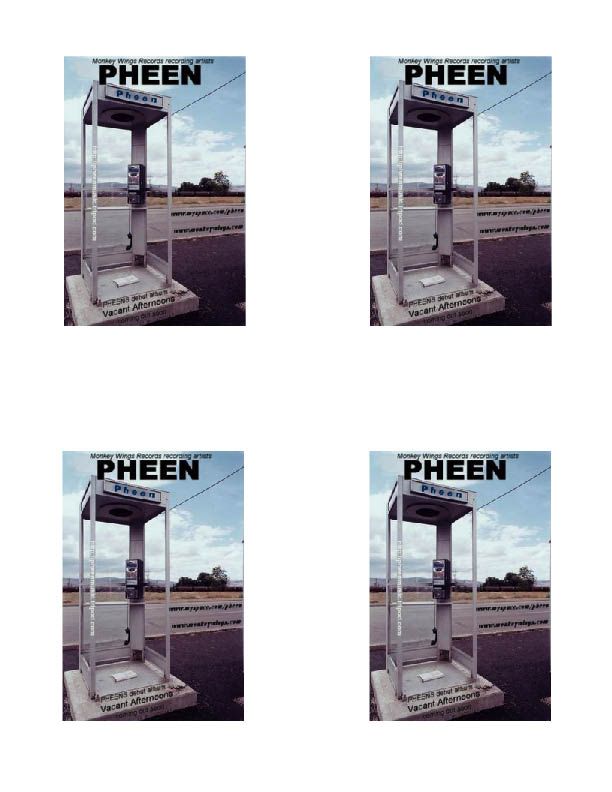
If you want to know what I am working on check out these sites:
OhSoHumorous.com
TopDailyMemes.com
BestDailyMemes.com
FortWayneMusic.om
Kwalis.com
SoHumorous.com
FailUniversity.com
FaceFullOf.com
NuZuDu.com
FireFlyGoods.com
ThePeopleBlog.com
StealMyMemes.com
DontStealMyMemes.com
More to come...
-
Oliver's Army
- Too Much Free Time
- Posts: 3228
- Joined: Mon Mar 08, 2004 5:14 pm
Or even higher for larger images.sharkmansix wrote: Finally, if this is going to be used for print, you might want to save the file at a higher Dpi (dots per inch). Your's was at 96 Dpi, which is not a standard. On the web 72 Dpi is fine, and for print I like to stay around 100 Dpi.
That way your text won't pixalate (become blurry) when printed.
I try to keep it at least 150-300 dpi.
But then again I work in television. My whole world is 72 dpi.
If you want to know what I am working on check out these sites:
OhSoHumorous.com
TopDailyMemes.com
BestDailyMemes.com
FortWayneMusic.om
Kwalis.com
SoHumorous.com
FailUniversity.com
FaceFullOf.com
NuZuDu.com
FireFlyGoods.com
ThePeopleBlog.com
StealMyMemes.com
DontStealMyMemes.com
More to come...
OhSoHumorous.com
TopDailyMemes.com
BestDailyMemes.com
FortWayneMusic.om
Kwalis.com
SoHumorous.com
FailUniversity.com
FaceFullOf.com
NuZuDu.com
FireFlyGoods.com
ThePeopleBlog.com
StealMyMemes.com
DontStealMyMemes.com
More to come...